
The challenge
ERPs like Odoo are organized around modules, not around anyone's working day. Clocking in, booking leave, filing an expense, ordering lunch, checking this month's revenue — five ordinary tasks scattered across five module hierarchies, each several clicks deep. Nothing is missing; everything is far away. So people quietly fall back to spreadsheets, group chats and paper on the wall, and the company pays for a system nobody opens.
How we judged it
The usable surface of a system this size is decided by its entry point, not its feature count. We did not add features or take any away. We took the tasks people do every day, ranked them by how often they happen, and let that ranking — not the module tree — decide what the first screen shows.
What we did
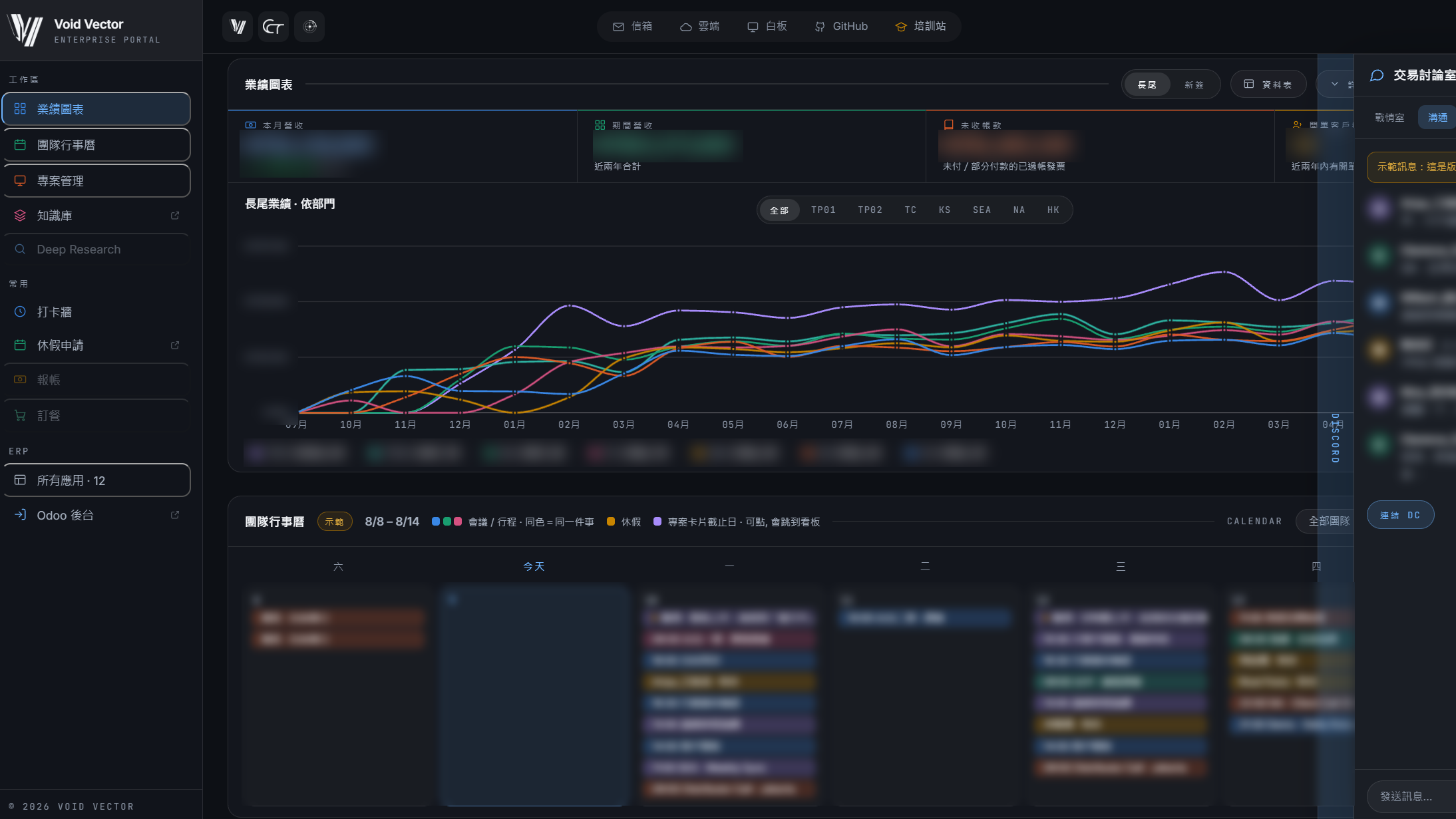
The landing screen became the two things people check daily: revenue charts and the team calendar. High-frequency small tasks — clock-in, leave, expenses, meal orders — sit in a single list one click away. The remaining twelve applications live in one drawer, and the Odoo back office stays as an explicit link rather than being hidden, so nobody is trapped inside our layer. Mail, cloud storage, whiteboard, GitHub and the training site were pulled into the same shell, and the team chat sits docked on the right instead of in another window. Visual design moved with the structure in one pass, not as a later reskin.
Results and the verdict
The learning cost dropped where it mattered: you no longer have to understand the ERP's taxonomy before you can use it. The verdict, honestly stated: for a system like this, the usability bottleneck is information architecture and the entry point, not the feature list — and redesigning the surface does not fix a bad structure underneath, which is why both had to move together. The honest caveat: this is our own system and the users are our own people, so treat it as a design account, not a controlled study.